
Time (In the Market) Heals All Wounds
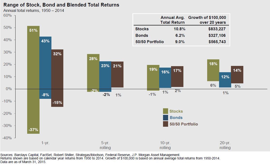
This chart gives some great insights into long-term investing. The two numbers listed on each bar are the highest and lowest returns for stocks, bonds, and a 50/50 blend of stocks and bonds over rolling periods of time between 1950 and 2014. Rather than focusing on average returns, this chart shows the extremes. The largest 1-year gain in stocks was 51% while the largest 1-year loss was 37%. Five, 10, and 20-year periods are also shown.
Across all time periods, stocks have higher volatility than bonds but also have better long-term returns. The average returns for stocks was 10.8% compared to 6.2% for bonds. Over a 20-year time period, the growth of $100,000 was $833,227 for stocks compared to $327,106 for bonds. Clearly, long-term investors need a healthy dose of stocks to grow their portfolios and keep up with inflation.
The blended portfolios offer a perspective into diversification. For the five and ten year periods, the blended portfolio had the best downside results, while keeping the upside potential in range with both stocks and bonds. The average return for the blended portfolio was 9.0%, which is higher than an average of the stock and bond average returns (8.5%). This is likely due to annual rebalancing which forces investors to sell high and buy low.
Of course the greatest takeaway from the chart is that the fluctuations of the markets even out over time. The downside risk is lowered and then taken away as the time period increases. In fact, although stocks are the most volatile, they provide the most favorable worst-case scenario over the 20 year period. Hopefully, we can keep the long-term view when the short term isn’t enjoyable.